Walking through the General Motors Heritage Center means discovering an unhidden but unknown treasure of Detroit. It's an oasis of design in the middle of a tract devoted to engineers, factories, and combination Pizza Hut-Taco Bells: cars and engines maintained and displayed like jewellry inside a brick-and-siding box. Our genial tour guide, an eleven-year employee who describes himself as a newcomer, spoke with a strange mixture of pride in the Center's invisibility to all but aficionados, and a wistfulness that more people aren't compelled to visit.
The space is invisible compared to its brilliant contents but utterly relentless. The moment you step in, you're in love with the vintage colors and meticulously polished chrome. Also the moment you step in, you understand everything there is to know about the space. The dynamic and intelligently arranged collections of cars are almost enough to seduce you into forgetting that you are in a concrete-and-steel box dimly illuminated by small skylights. At the end of the day, though, does that matter? The primary users of the Center are engineers doing technical research and car buffs indulging passionate hobbies. As an architect, the space leaves everything to be desired...but I'm unconvinced that that matters in any material way.
 |
| The uber-orthogonal building was relieved only once, with this element. |
 |
| Unlike the Ford mentality, where even tours to the factory can be had by anyone. |
 |
| BARCELONA CHAIRS |
 |
| The exhibits were lit with spotlights, but the upper part of the space was lit with natural light from skylights. |
 |
| Metal ad from the 70s. Plastic QR code from yesterday. |
 |
| At the heart of the space, which was visually dominated by the treasures within, was a regular column structure on regular floor plates. Regular, regular, regular. |
 |
| The center stage, an add-on, with a very minor bump to accommodate cars easily. |
 |
| ALL the dynamism in the space was provided by the content (although that was formidable). |
 |
| A blueprint of one of the earliest chassises |
 |
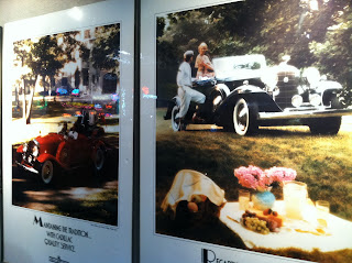
| Pastoral ads force nostalgia. They were fairly disconcerting. |
 |
| The one natural element in the entire display was highly fetishized. |
 |
| Although they made little actual impact in the space, the tinted spotlights added to the plastic (material, not characteristic) feel of the space. |
 |
| For people not there for the cars, control panels and simple work surfaces are tiny oases of function. |
 |
| Dampers. |
 |
| The verbal signs are more highly designed than the visual. (Actually, the one above the door is - well, submitted without further comment.) |
 |
| The white wall and "office area" door lead into-- |
 |
| A wall (literally) of color and material. |
 |
| The World Trade Towers, carefully crafted from layer upon layer of copper. |
 |
| State-of-the-art meets state-of-the-art. |
 |
| The atrium of GM's Renaissance Center. |
 |
| Architect John Portland designed spaces deliberately intended to invoke disorientation. I think the teal column both serves and thwarts his purposes. |
 |
| Are we inside, are we outside? |
 |
| Are we inside, are we outside? |
 |
| Small unprogrammed spaces seem excruciatingly uncomfortable for anything at all involving human activity. |
 |
| He even managed to make green unnatural. |
 |
| View from the 72nd floor: the sun seems a little bigger from this high up. |


No comments:
Post a Comment